It is often claimed by Climate "Skeptics" that Global Warming has stopped. This post will examine that claim.
Trends
The chart below plots the data set developed at the University of Alabama at Huntsville (UAH). I decided to use this data set as it is the one that is most popular with Climate "Skeptics". The data can be accessed here. The blog of one of the leaders of this group can be found here. As always on this blog, click on the graphic to see a larger and clearer version.
I produced this chart using the downloaded data in a statistical programming language called R. The script that I wrote can be found in Appendix 1 at the end of this post.
The red line charts the monthly data. The temperatures are quite variable, but just by eyeballing the plot, it is clear that there is a rising trend to the data. The black line is the linear best fit to the data set. According to the UAH data (bottom of page) the trend is 0.138 degrees celsius per decade. Over thirty years that trend will produce a 0.4oC of warming globally, but over shorter periods of time (say ten years or less) 0.138oC can be easily overwhelmed by the much larger year on year temperature changes. Consequently, trends taken over short time periods can show no trend, or a rising trend, or a declining trend, as can be seen clearly in the chart. Over time the more or less random variations cancel out and the real trend appears.
One feature that stands out clearly in the chart is the spectacularly warm year of 1998. This was caused by a very strong El Nino. For a few years, Climate "Skeptics" claimed that Global Warming stopped in 1998. Here is one example of such a claim. It is hardly surprising that the years immediatley following 1998 would be cooler. A problem arose for the "skeptics" when trends from 1998 to 2005, 2006 and 2007 showed an upward trend (click on years to see trend charts). The solution was simple - find a new date where a declining trend could be observed. In order to do this the "skeptics" had to move on four years in the temperature data - to 2002. Here is an article from 2008 that now states that Global Warming stopped not in 1998 but in 2002. The usual problem for the "sketics" is reappearing as the trend from 2002 is starting to appear in the data. See this link for a chart from 2002 to 2010.
It is clear that the only way to sustain an argument that atmospheric temperatures are cooling is by carefully choosing short periods of time to construct trends.
Statistical Significance
Another attempt by "skeptics" to cast doubt on the warming trend is to claim that "there has been no statistically significant warming in the atmospheric temperature record since 1995". By a process of Chinese Whispers this becomes "no significant warming since 1995" to "no warming since 1995" to "the planet is cooling". Here is an example of such an argument.
Before considering the meaning of statistically significant warming it is instrutive to investigate the trend from 1995. When reading articles like the one that I linked to in the previous paragraph, one would could assume that there has not been any trend in atmospheric temperature since 1995, but that view is clearly not true as shown by the chart below:
So far in this post I have only discussed one of the temperature data sets. In fact there are five of them - GISS, NOAA, Hadley, RSS as well as UAH. This post discusses the differences and similarities of all five groups. The video below shows trends for all five goups to the current date, from 1995 to 2008. Note that 90% of the trends are increasing. The script that I wrote to calculate the trends in the video is reproduced in Appendix 2.
The concept of statistical significance is quite complex and a proper understanding of it requries considerable study of statistics. Here is a post that discusses the idea of statistical significance, here is a post that discusses the claim that temperature data sets show no statistically significant warming since 1995, and here is a link to a video discussing the same information.
What is clear is that it is very likely that the temperature trends since 1995 are real. Technically it is not quite true to claim that the trends from 1995 are at least 92% probable, but that claim gives a sense of the issue. What is true is that the trends in all five temperature time series are statistically significant from 1994.
Other Indicators that the Planet is Warming
Temperatures in the atmosphere are not the only indicators that the globe is warming. Ten warming indicators are listed below, note that seven of them are not related to atmospheric temperatures.
Each of the ten indicators are changing in the direction that would be expected if the planet were warming.
Indicators that increase in a warming world:
Air temperature over land Air temperature over sea Troposphere temperature Sea surface temperature Ocean heat content Humidity Sea level
Indicators that decrease in a warming world:
Snow coverage Sea ice extent Glaciers
For more infirmation and evidence on these indicators see this post.
Conclusion
There are three major reasons that disprove the claims that global temperatures are not increasing: 1. their reliance on short time preiods to produce trends - which is statistically absurd 2. their use of the complex concept of statistical significance to give a false impression to those who don't understand any statistics 3. their reliance on just one of the many indicators of warming temperatures.
UPDATE: 09/09/2010 While I was writing this post I wondered whether Andrew Bolt (Australia's premier denier) would recognise the current warming reality. Finally he has done so at this post. Interestingly, Bolt doesn't comment on Roy Spencer's graph. He also points to an SBS show with the late Stephen Schneider, who politely explained to a large group of "skeptics" why their objections to AGW did not make sense. In the post Bolt also returned to his tried and true technique of misrepresenting the views of climate scientists, this time Tong Lee Michael McPhaden. See this post for a clearer discussion of the work on ENSO. Lastly Bolt continues to attempt to confuse his readers on Arctic sea ice.
#################### UAH_53 user defined trends ################# ## Written by Stephen Spencer, Tarneit, Victoria, Australia ## Date 20/08/2010
## STEP 1: SETUP - Source File par(las=1) link <- "C:\\Learn_R\\All_temp_groups.csv" ## STEP 2: READ DATA my_data <- read.table(link, sep = ",", dec=".", skip = 0, row.names = NULL, header = T, colClasses = rep("numeric", 2), na.strings = c("", "*", "-", -99.99,99.9, 999.9), col.names = c("yr","GISS","RSS","NOAA","UAH","HAD","UAH_53")) ## STEP 3: MANIPULATE DATA Title <- "Various trends in UAH data" #user defined function to calculate trend data #for user entered years calc_trend = function (start_date, end_date){ newdata <-(subset(my_data, yr>=(start_date +.042) & yr<= (end_date + .985))) first_lm = (lm(UAH_53 ~ yr, data = newdata)) a <- coef(first_lm)[1] b <- coef(first_lm)[2] x_vals <<- c(start_date, end_date) y_vals <<- c(a+b*(start_date +.042), a + b*(end_date + .985))}
## STEP 4 PLOT DATA AND TRENDS
# PLOT UAH_53 DATA FROM 1979 AND ADD TREND LINE plot(UAH_53 ~ yr, data = my_data, type="l", col = "red", xlab = "year", ylab = "temp", main = Title) full_lm = lm(UAH_53 ~ yr, data = my_data) abline(full_lm, lwd=3)
#CALCULATE TREND LINES FOR SHORT TIME PERIODS
#Calculate and draw trend from 1980 to 1987 calc_trend (1980, 1987) lines(x_vals, y_vals, col = "green", lwd=3)
#Calculate and draw trend from 1988 to 1995 calc_trend (1988, 1995) lines(x_vals, y_vals, col = "green", lwd=3)
#Calculate and draw trend from 2001 to 2008 calc_trend (2001, 2008.5) lines(x_vals, y_vals, col = "green", lwd=3)
#Calculate and draw trend from 1979 to 1988 calc_trend (1979, 1988) lines(x_vals, y_vals, col = "blue",lwd=3)
#Calculate and draw trend from 1990 to 1998 calc_trend (1990, 1998) lines(x_vals, y_vals, col = "blue", lwd=3)
#Calculate and draw trend from 2000 to 2007 calc_trend (2000, 2007) lines(x_vals, y_vals, col = "blue", lwd=3)
#Calculate and draw trend from 2000 to 2010 calc_trend (2001, 2010.99) lines(x_vals, y_vals, col = "blue", lwd=3)
Appendix 2
########## All data and trend analysis from userdefined date ######
## STEP 1: SETUP - Source File Link par(las=1) link <- "C:\\Learn_R\\All_temp_groups.csv"
## STEP 3: MANIPULATE DATA ## Change the year in the next line to the year that # you want to plot the trends from, not before 1979! yearfrom = 1995 # Create title for chart Title <- c("All data trends from", yearfrom) # Create a new data set from the selected year newdata <-(subset(my_data, yr>=yearfrom))
## STEP 4: CREATE CHART AND DRAW TREND LINES # Display only trend lines # Data has to be plotted so that abline operates # So plot data in white plot(GISS ~ yr, data = newdata, type="l", col = "white", xlab = "Year", ylab = "Temperature", main = Title) # Draw trend lines abline(lm(GISS ~ yr, data = newdata), col = "blue", lwd=3) abline(lm(RSS ~ yr, data = newdata), col = "red", lwd=3) abline(lm(NOAA ~ yr, data = newdata), col = "green", lwd=3) abline(lm(HAD ~ yr, data = newdata), col = "purple", lwd=3) abline(lm(UAH_53 ~ yr, data = newdata), col = "black", lwd=3)
## Insert text annotations # Calculate x position for text command x_pos <- yearfrom + 1 # Display names of data sets in appropriate colours text(x_pos,0.8, "GISS", col="blue", cex=1.5, ps = 20) text(x_pos,0.75, "NOAA", col="green", cex=1.5, ps = 20) text(x_pos,0.7, "HADLEY", col="purple", cex=1.5, ps = 20) text(x_pos,0.65, "RSS", col="red", cex=1.5, ps = 20) text(x_pos,0.6, "UAH", col="black", cex=1.5, ps = 20)
This film complemented a Radiolab podcast called Words.
Click on the play button to hear the (audio) podcast.
Here is Radiolab's summary of the podcast:
Words that Change the World
Susan Schaller believes that the best idea she ever had in her life had to do with an isolated young man she met one day at a community college. He was 27-years-old at the time, and though he had been born deaf, no one had ever taught him to sign. He had lived his entire life without language--until Susan found a way to reach out to him.
Charles Fernyhough doesn't think that very young children think--at least not in a way he'd recognize as thinking. Charles explains what he means by walking us through an experiment in a white room. And Elizabeth Spelke weighs in with research from her baby lab--which suggests a child's brain begins as a series of islands, until it can find the right words and phrases to bridge the gaps.
James Shapiro, a Shakespeare scholar at Columbia, argues that Shakespeare behaved more like a chemist than a writer: by smashing words together--words like eye and ball--he created new words, and new ways of seeing the world.
One morning, neurologist Jill Bolte Taylor woke up with a headache. A blood vessel then burst inside her left hemisphere, and silenced all the brain chatter in her head. She was left with no language. No memories. Just sensory intake, and an all-encompassing feeling of joy.
Here is how Jill Bolte taylor told her story at TED:
The graphic below sets out the utter absurdity of the Government and Opposition policies on Assylum Seekers. (Click on the graphic to open a larger version in a separate window or tab.)
I find myself in complete agreement with Malcolm Fraser (a former Liberal Party Prime Mininter) on this issue. In an interview with Margaret Simmons that can be found at this link Fraser said:
The Opposition plays politics with border protection.
The government has got a two headed policy, claiming to be more compassionate than Howard was and to an extent they are but on the other head of their policy they’re saying “we’re just as tough as Howard was”. They can’t have it both ways.
The opposition saying “You’re lost control of the borders" is arrant, absolute, bloody nonsense. (They) claim that 4 or 5 thousand people a year represent a threat to Australia. It’s not so. What we desperately need in this area is a government and an opposition that will develop a unified, sensible, compassionate, firm, if you like, policy, but one which they then take outside the realm of politics, because playing politics with this issue is playing politics with people’s lives, playing politics with people very often fleeing the most terrible tyranny or distress, and that’s the most unseemly thing we could do and it is something which is noticed right around the world and which just makes people wonder have we really put Tampa behind us and more extreme people will ask have we really put the white Australia policy behind us.
I almost feel like going to South Africa or Zimbabwe organise a boat load of white farmers, and I’d sail them into Fremantle harbour and that would expose the policy for what it is in one blow.
Note: the comment is towards the end of the interview. If you don't want to listen to the whole interview I have produced a verbatim summary at this post.
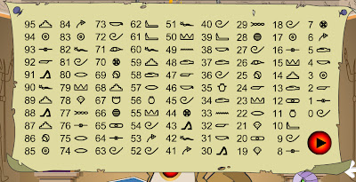
Click on the link and try out the puzzle before continuing. (If the "music" annoys you it can be turned off at the top right of the screen.)
Spooky!
Before explaining the puzzle I will walk through an example.
The number I picked is 26.
Add 2 and 6 together to get 8.
Subtract 8 from 26 to get 18.
Here is the symbol chart; carefully note the symbol to the right of 18.
The gopher displayed that same symbol as shown below:
Basic Explanation
Obviously if there was anything "psychic" really going on then the mathematical and symbolic process would not be necessary. It follows that there is some trick in the process.
The basic point is that the maths always results in a number that is a multiple of 9. In the symbol chart all multiples of 9 have the same symbol. Check in the symbol chart above to confirm this. Of cause multiples of 9 are: 9, 18, 27, 36, 45, 54, 63, 72 and 81. The numbers 90 and 99 cannot be produced by the process that the gopher describes. (For example, 99 - 18 = 81). For the explanation of why the process always produces a multiple of 9 see the Matematical Explanation section below.
Every time that you do this puzzle a different symbol chart is used, but always multiples of 9 have the same symbol. Here is another example:
So all the gopher has to do is display the symbol for multiples of 9 that are used in the chart that he shows you.
Mathematical Explanation
Some basic maths can explain why the process will always produce a number that is a multiple of 9.
A two digit number can be written as:
10a + b (note 10a is and equivalent way of writing 10 X a)
The gopher asked us to add the two digits together which can be written as (a + b)
He then asked us to take the sum of the digits away from the original number, which can be written as:
10a + b - (a + b)
=10a + b - a - b
Rearranging we get:
10a - a + b - b
The b values cancel (ie b - b = 0) so
10a - a
= 9a
All results of the maths are multiples of 9. In the worked example, the number is 26. In that case a = 2 and b = 6 and 9a = 9 X 2 = 18, a multiple of 9.
Although we have only been directly measuring temperature for the last 150 years and have been measuring atmospheric carbon dioxide (CO2) for only the last 50 years, scientists have found ingenious methods of measuring these values globally for hundreds of millions of years into the past. For detailed information on these proxy methods of measurement see this post.
Temperature Reconstruction
The current post considers temperature and CO2 reconstruction over the last 400,000 years, as illustrated in the graphic below. As always on this blog click on the graphic to open a larger version of it in a window or tab. The top pane of the graphic shows temperatures (in Antartica), the middle pane CO2 and the bottom one dust levels. The left hand side is the present, the right hand side is 400,000 years ago. The data for these graphs was produced from ice cores drilled into the ice sheet. The video later in this post graphically shows the process of drilling and analysing ice cores.
One of the things that stands out most in the graphic is that the planet has been quite cold over most of the last 400,000 years. There are only five short lived warmer periods, called interglacials. We are currently living in the latest interglacial, in fact the whole of human civilisation has occurred during the current interglacial - called by geologists the Holocene.
There is a fairly obvious cycle in the temperature data of a little over 100,000 years. The generally accepted explanation for this periodicity involves the Earth's orbit around the sun, and is called Milankovitch Cycles, after the theory's originator.
The Eemian
The interglacial preceeding the current one is called the Eemian. For a detailed description of the Eemian Interglacial follow this link. The Eemian probably lasted from 127,000 to 118,000 years ago, but there is still debate on its exact length as indicated by the previous link.
The graphic below shows temperature levels for the last 150,000 years. The Eemian, Holocene and the glacial period between them can be seen clearly. It is obvious that the peak temperature of the Eemain was higher than that of the Holocene (so far). The Eemian also lasted for a shorter period of time. A likely explanation for these differences is in the values of the Milankovitch forcings.
Given that most experts think that global temperatures will increase over the next century, the Eemian is an important period of time to study. The North Greenland Eemian Ice Drilling project (NEEM) is one large scale project that is studying this important period of Earth's history.
Ice Core Drilling at NEEM
The video below describes the NEEM project and introduces some to the techniques that are used to extract information from the ice cores.
How to Drill an Ice Core
The following notes and graphic come from this link. (Note that there are two noisy graphics that automatically start on this page.)
The drill used for the NEEM ice core drilling is based on a design that goes more than 3 decades back to the DYE-3 deep drilling in South Greenland. The drill is a self-contained unit only connected to the surface by an 7.3 mm thick steel cable. Inside the cable, power for the drill is transmitted together with control commands from the operators.
The drill is about 13.5 meters long, and is shown here with the outer barrel (indicated by green) removed. When operational, only the drill head and the anti-torque section (lower right) are visible.
36 have been accused of spouse abuse 7 have been arrested for fraud 19 have been accused of writing bad cheques 117 have directly or indirectly bankrupted at least 2 businesses 3 have done time for assault 71, repeat 71 cannot get a credit card due to bad credit 14 have been arrested on drug-related charges 8 have been arrested for shoplifting 21 currently are defendants in lawsuits and 84 have been arrested for drunk driving in the last year
Can you guess which organization this is? AFL? NRL?
Give up yet? . . . .... Scroll down
Neither, it's the 535 members of the AUSTRALIAN PARLIAMENT IN CANBERRA
The same group of Idiots that crank out hundreds of new laws each year, designed to keep the rest of us in line.
This ties in nicely with the general dislike of politicians, so lots of people will be happy to believe it. Sadly the claims aren't true. This post isn't really about playing the spoil sport and ruining a good story with the facts . My aim is to foster skepticism about claims that are made on the Internet.
As soon as I read the email I was suspicious, as I was sure that there weren't 535 members of the Australian Parliament. I pasted the following number of members in australian parliament
into google and found a number of sites including this one.
So there are 150 members in the House of Representatives and 76 in the Senate making a grand total of 226 members of the Australian Parliament.
With this information the claims in the email are clearly absurd - 51% of members have directly or indirectly bankrupted at least 2 businesses or 31% cannot get a credit card due to bad credit?
So where did the "information" in this email come from?
I selected most of the text of the email and pasted it into google?
The site at this link was the fourth in the Google list.
A quick perusal of this site shows that the "information" in the email originated in the United States. It also shows that the info is dubious in a US context.
The person who adapted these claims to an Australian context clearly knew that the claims made were not true, as they made four changes to make the claims appear to relate to Australia.
If you have any opinion as to the motivation of someone to make and spread such hoaxes, leave a comment by clicking on "Post a Comment" at the bottom of this post.
There are many of these email hoaxes circulating, here are a few that I have received recently:
the Budweiser Celebration of 9/11 hoax. I checked the local paper The Bakersfield Californian and found this article that supports the claim that the email is a hoax - scroll down to the last 6 paragraphs of the story.
the Cigar Arsonist. The email that I received claiming that this story was true was headed You Can't Make this Stuff Up!, unfortunately it is clear that it was almost certainly made up. A song called The Cigar Song has been written about this scam.
the Nokia Mobile Draw scam. I recieved the following text message:
YOUR MOBILE NUMBER HAS WON YOU $ 2,MILLION IN THE NOKIA MOBILE DRAW UK.FOR CLAIMS, EMAIL US: (Ticket: BAN101Q/NAME/LOCATION): nkprom@live.com, Call: +447035959397
I was immediately suspicious and when I googled the message I found this site which confirmed my impression that this was a scam text.
I have been aware of Wilfred Owen as a war poet since I was a teenager. Some how or other I missed this one until Christopher Hitchins mentioned it being read out loud in class when he was at school.
The description of a single incident in the Great War makes a profound and powerful statement against all wars. World War I poetry has particular poignancy for me as my paternal grandfather participated in that war.
DULCE ET DECORUM EST by WILFRED OWEN
Bent double, like old beggars under sacks, Knock-kneed, coughing like hags, we cursed through sludge, Till on the haunting flares we turned our backs And towards our distant rest began to trudge. Men marched asleep. Many had lost their boots But limped on, blood-shod. All went lame; all blind; Drunk with fatigue; deaf even to the hoots Of tired, outstripped Five-Nines that dropped behind.
Gas! Gas! Quick, boys!---An ecstasy of fumbling, Fitting the clumsy helmets just in time; But someone still was yelling out and stumbling, And flound'ring like a man in fire or lime... Dim, through the misty panes and thick green light, As under a green sea, I saw him drowning.
In all my dreams, before my helpless sight, He plunges at me, guttering, choking, drowning.
If in some smothering dreams you too could pace Behind the wagon that we flung him in, And watch the white eyes writhing in his face, His hanging face, like a devil's sick of sin; If you could hear, at every jolt, the blood Come gargling from the froth-corrupted lungs, Obscene as cancer, bitter as the cud Of vile, incurable sores on innocent tongues,--- My friend, you would not tell with such high zest To children ardent for some desperate glory, The old Lie: Dulce et decorum est Pro patria mori.
Dulce et decorum est Pro patria mori roughly translates to: It is sweet and honourable to die for one’s country
Hitchins wrote:
... the words of Owen's "Dulce et Decorum Est" went off like a landmine under my concept of history and empire. The moment came in class. It was the turn of a very handsome boy named Sean Watson to read. As he stumbled his bored and boring way through the lines, I was consumed first by a sense of outrage, as if seeing somebody taking an axe to a grand piano. How could anybody be so brutish and insensitive? I wanted to wrench the book from his hands and declaim the poem. But then I found that this would not in fact be possible, because my eyes were blinded with stinging tears. To this day, I have difficulty reciting the poem out loud without a catch in my throat.
source: Christopher Hitchins, Hitch-22 A Memoir, Allen & Unwin 2010, page 71
There are multiple lines of evidence demonstrating that Global Warming is occurring and that it is Anthropogenic (ie human caused).
It is clear that the vast majority of people qualified to make a judgement on the issue of Anthropogenic Global Warming (AGW) are of the view that it is occurring and is of concern. See this post on the consensus.
For the majority of us who don't have the time, or skill to become real experts on this topic, the video below sets out many of the lines of evidence in less than 10 minutes.
The video was produced by James Powell. Here is Powell's website, which contains a range of other resources. Here is a link to the graphics used in the video.
The US National Oceanic and Atmospheric Administration (NOAA) has just released its State of the Climate : 2009.
Here is a video describing the highlights of the report:
The report includes this graphic, which notes ten indicators of a warming world.
Note that each of the ten indicators are changing in the direction that would be expected if the planet were warming.
Indicators that increase in a warming world:
Air temperature over land click here for NOAA chart. Air temperature over sea click here for NOAA chart. Troposphere temperature click here for NOAA chart. Sea surface temperature click here for NOAA chart. Ocean heat content click here for NOAA chart. Humidity click here for NOAA chart. Sea level click here for NOAA chart.
Indicators that decrease in a warming world: Snow coverage click here for NOAA chart. Sea ice extent click here for NOAA chart. Glaciers click here for NOAA chart.
The course was very informative, challenging, and very well run. Thanks to Professor Camilleri for his organisation of the course and many interesting lectures and guest speakers.
The course covered the following:
Making sense of ‘our times’:
It is often said that we live in a globalising world? What does this mean? How different is today’s world from that of our parents or grandparents? Is the Modern world ushered in by the Renaissance and the revolutions of the 16th to the 18th centuries coming to an end? If so, what is taking its place?
The global financial crisis: why, where and how?
How do we explain the unprecedented growth of international finance? What factors have led to the current global financial crisis? What are the long-term implications of the crisis? What do we make of the responses of governments? Of the major international organisations? Where does the crisis leave the rich-poor divide? What are the prospects for greater international regulation?
Climate change: after Copenhagen
What are the key issues at stake in international climate change negotiations? Why are governments finding it so difficult to come to terms with the challenges posed by climate change? What are the prospects for stabilising global warming? Has Australia’s position on climate change shifted significantly since the election of the Rudd Government?
Arc of conflict: from Algeria to Afghanistan:
How do we account for the conflicts that have dotted the recent history of this part of the world? What lies behind the conflicts in the Middle East, Iraq, Iran, Afghanistan, Pakistan? How do we make sense of the relationship between Islam and the West? Are international terrorism and the ‘war on terror’ here to stay?
Conflict resolution and the dialogue of cultures:
Are the world’s major civilisations on a collision course? With the decline of the world’s colonial empires, is Western dominance coming to an end? Are we seeing the rise of new centres of power and influence? Can collision be avoided? What are the prospects for dialogue and conflict resolution? How can dialogue be approached internationally? In Australia?
The puzzle that is Australia:
How well are Australians coping with the pressures of a rapidly changing world? How well is Australia managing cultural and religious diversity at home and in its relations with Asia and the Pacific? Does multiculturalism have a future? What of our relations with the United states on the one hand and China on the other? What are the options facing Australia over the next decade and beyond?
The assignments that I produced for the course and some of the research that I conducted on the topics can be found at the links below: